Skinning Questions, Suggestions and Ideas
Precapice
SLoB Wrote: dodgy link
Fixed thanks.
Precapice
Xion Supporter
Posts: 5Joined: October 16th, 2006, 5:25 am
pickle
Precapice Wrote: How do I submit this skin here ? I've looked around a see no place to upload.
Click on
Contact & change the 'To:' field to 'Skin submissions'
pickle
Xion Admirer
Posts: 180Joined: September 9th, 2006, 3:56 pm
Precapice
Click on
Contact & change the 'To:' field to 'Skin submissions'
Hmmm I think a BIG shiney button that says submit skin would be honey to the fly's
Thank you for the help .
Precapice
Xion Supporter
Posts: 5Joined: October 16th, 2006, 5:25 am
chedabob
theres mine. its taken from a concept for an ipod on iPod Lounge. Its not quite finished.
gotta say, i love the skin interface. its sooo much easier than anything ive used before. great job.
chedabob
Xion Supporter
Posts: 1Joined: October 21st, 2006, 6:40 am
HyperCannon
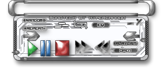
This ones close to finishing, but is a bit crude compaired to others
Its called MonoTECH:
HyperCannon
Xion Supporter
Posts: 79Joined: October 22nd, 2006, 6:53 amLocation: New Zealand
Precapice
HyperCannon Wrote: This ones close to finishing, but is a bit crude compaired to others
Its called MonoTECH:
Only one way to improve my friend
I would advize you to loze the drop shadow on the buttons and make them smaller , hope that helps.
Precapice
Xion Supporter
Posts: 5Joined: October 16th, 2006, 5:25 am
Infind
I dont see anything wrong with the size of nor the drop shadow on the buttons
Infind
Xion Supporter
Posts: 15Joined: October 4th, 2006, 4:27 pm
SLoB
get rid of the monotech by hypercannon too, you can always put your name in the preview layer, its also too crowded as an oversite sort of thing anyways
SLoB
Xion Junkie
Posts: 1340Joined: September 11th, 2006, 9:21 pmLocation: UK
Precapice
Infind Wrote: I dont see anything wrong with the size of nor the drop shadow on the buttons
Hence the reduction in size.
Precapice
Xion Supporter
Posts: 5Joined: October 16th, 2006, 5:25 am
HyperCannon
Thats for ur tips guys.
HyperCannon
Xion Supporter
Posts: 79Joined: October 22nd, 2006, 6:53 amLocation: New Zealand
cerberus
not sure if it'll ever get finished XD
just a quickie skin to match my new theme <_<
cerberus
Xion Supporter
Posts: 10Joined: September 22nd, 2006, 3:27 pmLocation: Hong Kong
nicholass
Looks soooo sweet cerberus
//Nicholas
nicholass
Xion Supporter
Posts: 37Joined: September 9th, 2006, 8:18 pm
cerberus
thanks NIc
cerberus
Xion Supporter
Posts: 10Joined: September 22nd, 2006, 3:27 pmLocation: Hong Kong
SLoB
yea i like this cerberus, really nice trigger/handle section top left and the main player is cool, the main lcd could do with a little seperation but the style is cool, i would also like to see a bigger version of that main player in a more metal looking style too
SLoB
Xion Junkie
Posts: 1340Joined: September 11th, 2006, 9:21 pmLocation: UK
ForceField
cerberus, you should finish it! This skin is too good to be wasted.
It's amazing,there is a lot of new skins here.The skinners here are working very fast!!!
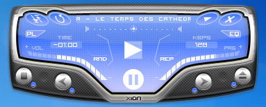
Ok,here is CRUISER(because it looks like a plane),my first skin for XION.It is already Finished and I will submit it very soon.I may change a little the GUI but it is almost done.
I hope that you will Like it.
ForceField
Xion Admirer
Posts: 112Joined: September 25th, 2006, 12:16 amLocation: Lebanon,Beirut
Return to General Skin Discussion
Who is online
Users browsing this forum: No registered users and 16 guests