(@SLoB: look!)
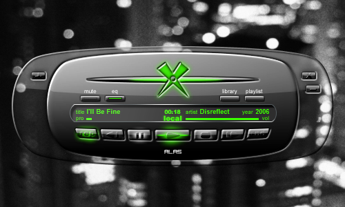
-buttons are glassy-transparent
-the X in the big mode is glassy-transparent and gets that green glow by vol amount l/r
-both modes: left right volume animations: horizontal green ellipse expanding with vol amount
feedback needed
7 posts
• Page 1 of 1
started making something "commonplace" just for fun and exercise. With most functions Xion offers implemented ..and a little gloss- a little glass- a little aero.. (for high ratings on certain skin sites, hehe). By working with it I started liking it, and thought one aero for Xion is ok, but now, I´m not quite shure what to think about it. So I would much appreciate your oppinion!
(@SLoB: look!)
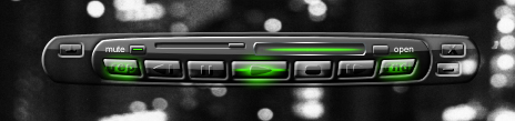
-buttons are glassy-transparent -the X in the big mode is glassy-transparent and gets that green glow by vol amount l/r -both modes: left right volume animations: horizontal green ellipse expanding with vol amount
My humble 2 cents:
Cool skin, reminds me of x-box? and the glassy-transparent look is very nice too Some of the buttons though are a little too hard to see, so maybe changing them somehow is a good idea
Hey I like that! I really like the mute, eq, etc. buttons. I know this may be blasphemous in this forum, but I'm really not a fan of the Xion "X" logo. I think your skin would be better off without it. (or perhaps make it a little more subtle) The other other criticism I have is to add a little more seperation between items in the display area. Some of the things seem to run together a little bit. Looks sweet tho! Keep it up!
yay
small mode looks good, agree with Kev on the logo, perhaps make it greyscale and subtle on the left or right, thers plenty of space for a smaller one funny you were thinking green, i started on another skin the other nite which incorporates the Xion logo, but its subtle i would make he buttons on the sides bigger, thers shed loads of space, so user click able area is huge, about twice the size i reckon
hey thanks all for your comments
yes the "X"; that letter is indeed a little `worn-out´ these days (X-Box, X-Files, X-Men). Though I think the Xion-X is o.k. I think I´ll substitute it in the skin completely (it´s indeed too similar to X-Box, also green, I think....). The hard-to-see buttons have a slightly white glowing over-state to identify them-you can´t see it here. I´ll post a link to download a later version to test it...
Looks like quite a good skin but let more subtlety envelope your outer glows.
7 posts
• Page 1 of 1
Return to Pre-Release Skin Designs Who is onlineUsers browsing this forum: No registered users and 15 guests |
