Page 1 of 1

Inky Pre-Release

PostPosted: March 16th, 2009, 12:15 am
by Nemesis
Yo peeps.

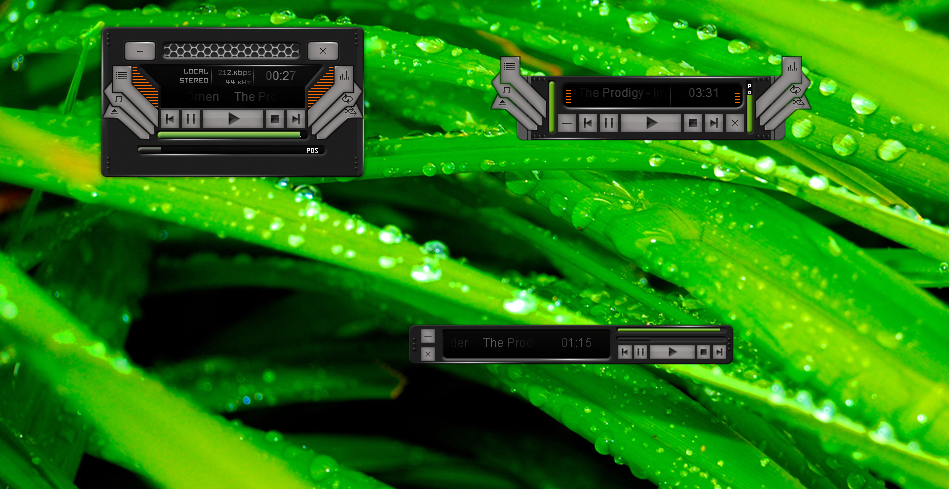
Have been working with this skin for a couple of days. Looking for some feedback before release, what do you like/what don't you like? Suggested improvements etc....

Preview -

Image

Files -

http://www.filefactory.com/file/af5352e/n/Inky_Test_zip

All you need to do is copy the .zip to the xion/interface directory.

re inky

PostPosted: March 16th, 2009, 12:50 am
by xonenine
I think you have a good skin going.One thing I'd want is a little more shadow on the gray buttons/arms to make them have a little depth.xonenine. :)

PostPosted: March 16th, 2009, 2:01 am
by logokas
Concept: Nice
Detail: Nice
Problems: I can read a maximum of 5 letters clearly on the titlebar. That's bad. Really bad. You can't make out the name of the song like that, there's just too little space.

And it's flat.

PostPosted: March 16th, 2009, 8:41 am
by Jikaru
logokas Wrote:Concept: Nice
Detail: Nice
Problems: I can read a maximum of 5 letters clearly on the titlebar. That's bad. Really bad. You can't make out the name of the song like that, there's just too little space.

And it's flat.


i agree about the concept and detail, the problem is you should lighten the gradient for the text in the track layer. Other than that I think your volume bar needs to be orange or your beats should be green. I don't think that green and orange match well the way you have them...The parts containing options like your random and repeat etc etc look flat. Maybe if they were more tube like ( think engine or motorcycle muffler )

If you want you can use this, just something I painted up real quick. You could like etch the symbols into it that would definitely add depth to it.
Image